WordPress CSS-Only Dropdown Menu
Create a CSS-only dropdown navigation menu for a classic WordPress theme using wp_nav_menu(), a custom Walker_Nav_Menu class, and CSS.
This tutorial demonstrates a three-level navigation structure with dropdown submenus. It includes a working layout example and shows how to add depth-specific CSS classes to customize each submenu level.
Note: This approach is intended for classic WordPress themes that use PHP templates. Modern block themes use the WordPress Navigation block and generally do not require a custom menu walker.
Live example
The example below demonstrates a horizontal navigation menu with dropdown submenus. The menu uses three levels:
- Level 1: Main navigation items.
- Level 2: Dropdown items displayed below the main menu.
- Level 3: Nested submenu links grouped within the dropdown.
The layout is controlled using CSS, while WordPress generates the menu structure dynamically.
I want to share code snippet for WordPress CMS dropdown menu 🎉 💯: CodePen
For this kind of menu I used three level menu structure:
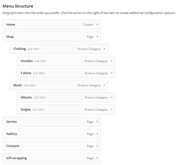
How the WordPress dropdown menu works
WordPress generates navigation menus using the wp_nav_menu() function. By default, submenu elements receive the sub-menu CSS class.
For this example, we extend the Walker_Nav_Menu class to assign additional classes based on submenu depth. This makes it possible to style different navigation levels independently.
The customized walker generates classes such as sub-menu-0 and sub-menu-1, which are used by the CSS rules in the following sections.
Step 1: Register the WordPress menu
Add the following PHP code to your classic theme's functions.php file.
The code registers a primary navigation menu and defines a custom walker that adds depth-specific CSS classes to its submenus.
function xorbin_register_menus() {
    register_nav_menus(
        array(
            'primary-menu' => 'Primary Menu',
        )
    );
}
add_action( 'after_setup_theme', 'xorbin_register_menus' );

class Xorbin_Submenu_Walker extends Walker_Nav_Menu {
    public function start_lvl( &$output, $depth = 0, $args = null ) {
        $indent = str_repeat( "\t", $depth );
        $class  = 'sub-menu sub-menu-' . $depth;

        $output .= "\n$indent<ul class=\"" . esc_attr( $class ) . "\">\n";
    }
}
Step 2: Display the navigation menu
Add the following code to your classic theme's header.php file, or wherever the main navigation should appear.
The wp_nav_menu() function displays the registered menu using the custom walker defined in the previous step.
<nav class="xorbin-dropdown" aria-label="Primary navigation">
    <?php
    wp_nav_menu(
        array(
            'theme_location' => 'primary-menu',
            'menu_class'     => 'primary-menu',
            'container'      => false,
            'fallback_cb'    => false,
            'depth'          => 3,
            'walker'         => new Xorbin_Submenu_Walker(),
        )
    );
    ?>
</nav>
After adding the code, assign a menu to the Primary Menu location in your WordPress administration area.
The menu can contain parent items, child items, and nested child items. WordPress will generate the corresponding HTML structure automatically.
Step 3: Style the dropdown menu with CSS
Add the following CSS rules to your classic theme's style.css file.
The stylesheet creates a horizontal navigation menu with dropdown sections. The sub-menu-0 and sub-menu-1 classes allow each submenu level to have its own appearance.
The dropdown becomes visible when its parent item is hovered over or receives keyboard focus through one of its descendants.
/* Main navigation */
.xorbin-dropdown {
    position: relative;
    font-family: "Trebuchet MS", Helvetica, sans-serif;
}

.xorbin-dropdown ul {
    margin: 0;
    padding: 0;
    list-style: none;
}

.xorbin-dropdown a {
    color: #000;
    text-decoration: none;
}

.xorbin-dropdown > ul {
    text-align: center;
}

.xorbin-dropdown > ul > li {
    display: inline-block;
    vertical-align: top;
}

.xorbin-dropdown > ul > li > a {
    display: block;
    padding: 0 30px 15px;
    font-size: 13px;
    font-weight: bold;
    letter-spacing: 1px;
    text-transform: uppercase;
}

/* First-level dropdown */
.xorbin-dropdown ul.sub-menu-0 {
    position: absolute;
    top: 100%;
    left: 0;
    z-index: 300;
    display: none;
    width: 100%;
    padding: 20px 0;
    background: #f5f4f4;
    text-align: center;
}

.xorbin-dropdown ul.sub-menu-0 > li {
    display: inline-block;
    vertical-align: top;
    text-align: left;
}

.xorbin-dropdown ul.sub-menu-0 > li > a {
    display: block;
    padding: 0;
    font-size: 13px;
    font-weight: normal;
    text-transform: uppercase;
}

/* Show dropdown on hover or keyboard focus */
.xorbin-dropdown > ul > li:hover > ul.sub-menu-0,
.xorbin-dropdown > ul > li:focus-within > ul.sub-menu-0 {
    display: block;
}

/* Second-level submenu */
.xorbin-dropdown ul.sub-menu-1 {
    width: 140px;
    padding: 20px 30px 40px 0;
    text-align: left;
}

.xorbin-dropdown ul.sub-menu-1 > li {
    display: block;
}

.xorbin-dropdown ul.sub-menu-1 a {
    display: block;
    padding: 0 0 5px;
    font-size: 12px;
    font-weight: normal;
    text-transform: none;
}

/* Hover and keyboard focus */
.xorbin-dropdown a:hover {
    color: #581311;
    text-decoration: underline;
}

.xorbin-dropdown a:focus-visible {
    outline: 2px solid #581311;
    outline-offset: 3px;
}

/* Responsive layout */
@media screen and (max-width: 768px) {
    .xorbin-dropdown > ul > li {
        display: block;
    }

    .xorbin-dropdown > ul > li > a {
        padding: 12px 15px;
    }

    .xorbin-dropdown ul.sub-menu-0 {
        position: static;
        width: 100%;
        padding: 10px 15px;
    }

    .xorbin-dropdown ul.sub-menu-0 > li {
        display: block;
        padding: 8px 0;
    }

    .xorbin-dropdown ul.sub-menu-1 {
        width: auto;
        padding: 10px 0 10px 15px;
    }
}
Accessibility and mobile compatibility
CSS-only dropdown menus can work well for desktop navigation, but they require additional consideration for keyboard and touchscreen users.
The example uses :hover to reveal submenus with a mouse and :focus-within to support keyboard navigation.
However, CSS-only menus have limitations:
- Keyboard navigation: Users should be able to reach all menu links using the Tab key, with clearly visible focus indicators.
- Touchscreens: Hover-based menus may behave differently across devices. Parent links and submenu access must be tested on phones and tablets.
- Mobile layouts: A horizontal navigation menu may need a responsive layout or a separate menu toggle on smaller screens.
- Screen readers: Nested links should use meaningful labels and maintain a logical navigation structure.
For production websites requiring reliable mobile dropdown controls, consider using accessible submenu buttons with JavaScript or the built-in WordPress Navigation block.
The example is intended as a starting point for customizing classic WordPress navigation, not a complete accessible mobile navigation system.
Frequently asked questions
Does this dropdown menu work with modern WordPress themes?
This tutorial is designed for classic WordPress themes that use PHP templates and the wp_nav_menu() function. Modern block themes generally use the Navigation block, which provides built-in submenu functionality.
Does a CSS-only dropdown menu require JavaScript?
No. Basic dropdown visibility can be controlled using CSS selectors such as :hover and :focus-within. However, JavaScript may be needed for reliable mobile menu toggles, advanced accessibility features, and more complex interactions.
What is Walker_Nav_Menu in WordPress?
Walker_Nav_Menu is a WordPress class responsible for generating navigation menu HTML. Developers can extend this class to customize menu markup, including adding CSS classes based on submenu depth.
Can I create a WordPress dropdown menu without a custom walker?
Yes. WordPress already generates nested navigation lists and applies the sub-menu class to dropdowns. A custom walker is only necessary when you need additional control over the generated HTML or CSS classes.
Related resources
- WordPress Navigation block — Create and customize navigation menus in block themes.
- Walker_Nav_Menu documentation — Learn how WordPress generates navigation menu HTML.
- wp_nav_menu() reference — Explore menu rendering options for classic themes.